Fonts of electronic books
At the reading of the book (if it is not format DJVU or PDF) you can adjust a font size and font family. Thus some kinds of a font will be read conveniently and easily, others will be badly perceived.
The bright, beautiful, well perceived font first of all is necessary for long comfortable reading of books. One of properties of human vision is bad perception of colour, of small or thin details. Therefore visually thin fonts are perceived by more grey, than bold fonts. At each electronic book initially there is a set from several fonts that the user could choose what approaches it more. Usually default set use fonts Arial and Times.
There is a possibility of downloading of the user fonts of format TTF in some models of electronic books. It is very confortable. You can use such fonts, which most of all will be pleasant to you and directly copy from a folder Windows/fonts (or from the Internet) to them in the e-reader. It is possible to download a special set of fonts and from our site.
Anit-aliasing font function
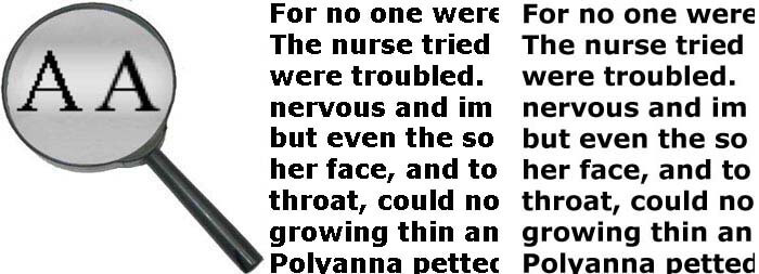
The software of certain model of the electronic book can have or not have function of anti-aliasing of fonts. If function of anti-aliasing is not present (or it is off) every symbol looks like black colour on white without semitones on the screen. Thus direct horizontal and vertical lines of each character print accurately and beautifully, and the bent and inclined lines of characters are traced by "stairs".
If function of anti-aliasing of a font is support, the bent and inclined edges of characters appear semitones and from it become more smooth. Visually letters become more beautiful also the text is better perceived. This function takes away resources from the microprocessor of the e-book reader and the text with the included anti-aliasing is displayed slightly more slowly, but for an eye such delay practically is not appreciable.
Font kerning
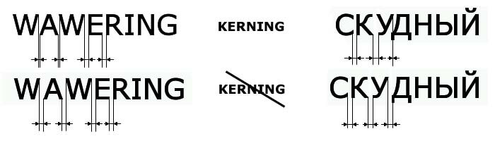
Kerning is changing of the distance between certain pairs of symbols to improve visual perception of the font. This option implies individual work with each pair of letters and the selection of their lokation, depending on the selected font . When kerning is activated, some pairs of symbols (such as , W-A, A-V, У - Д in the top row of the figure) to approach each other. Distance between the contours of the letters in the word are less than others , but visually it is perceived more harmoniously than equal distances between the symbols (the bottom line in the figure).
Carry the words in the text
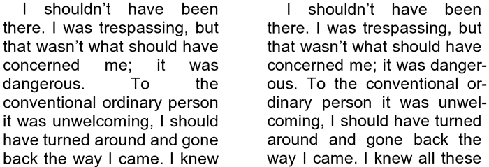
Not all models of electronic books have function of support of carry the words in the text by national language rules. In the presence of such function the text is distributed on the screen in regular intervals, the long words which are not located at line, break carrying over on two parts. In the absence of function of support of carrying over the text on the screen contains it is disproportionate the big emptiness. To read such text certainly it is possible, but for an eye it is not very pleasant.
Footnotes on page
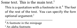
Some models of e-book readers at reading in formats MOBI, PRC, FB2 allow to deduce footnotes to the text at the bottom of current page. It is very comfortable and as much as possible approaches reading of an electronic variant of the book to the paper book. In other models of e-readers it is necessary to flip through the book text up to the end, to read the footnotes , and then to come back to that page on which there was a footnote. The part of models of electronic books at all does not show footnotes. As a particular model of devices for reading processes footnotes can be found in the summary table of parameters.
Next
